
.png)
My Role
During the creation of this project, my responsibilities included user research, concept ideation, designing user flows, visual design, prototyping, user testing, and incorporating feedback from users into iterations.
About this Project
Smart Nest was designed to educate customers about the benefits of owning a smart refrigerator, as well as help them make informed purchase decisions when upgrading from a traditional refrigerator to a smart one. Smart fridges are internet-connected appliances that come with touchscreens and provide services related to food, entertainment, home security, family reminders, and more.
The challenge
While smart refrigerators have been around since 1998, they have not yet achieved widespread consumer acceptance. Findings such as these raise questions as to how users accept or reject new technologies, as well as how they see them. The aim of this case study is to gain a better understanding of the factors that influence customer decision-making when upgrading to a smart refrigerator.
Solution
To better understand the problem space, I used a user-centered design approach.
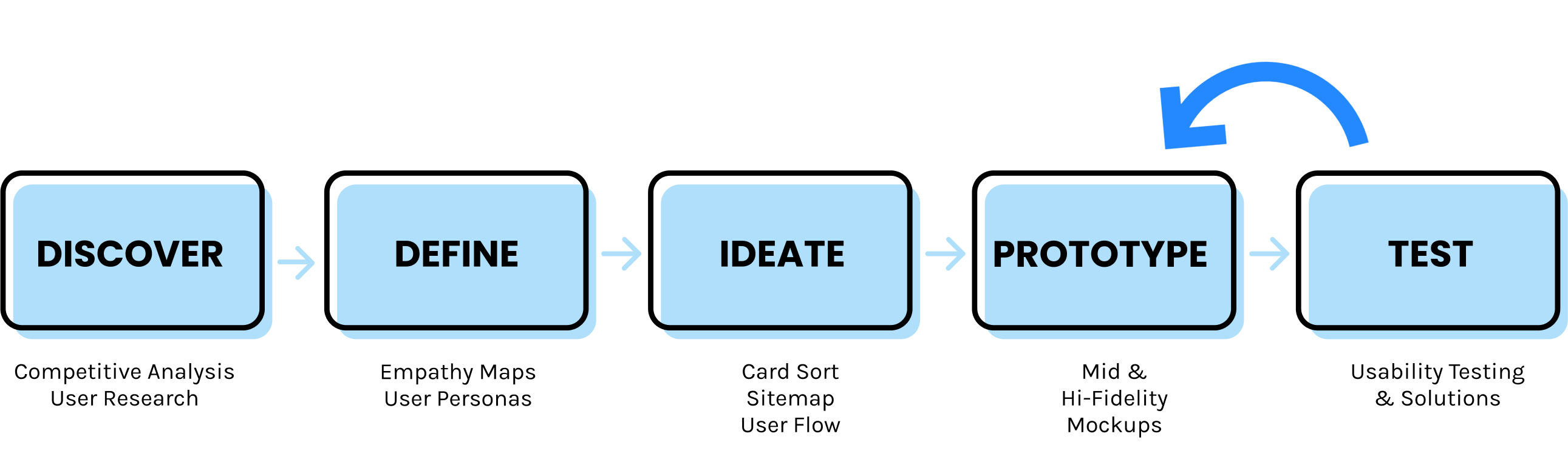
Discover
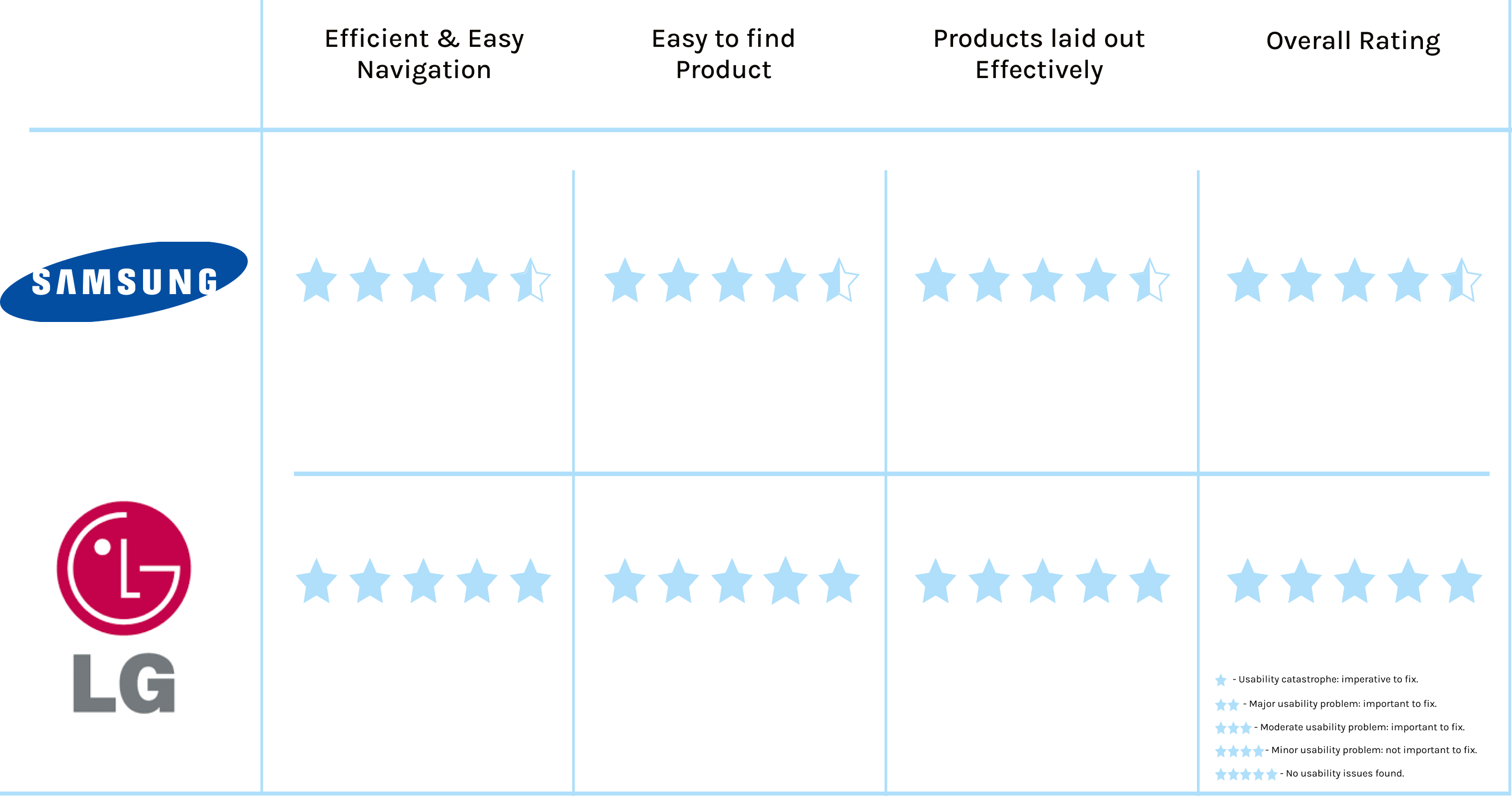
Competitive Analysis:
After thoroughly analyzing my competition, I identified two leading manufacturers of smart refrigerators, Samsung and LG. I compared the overall usability of each of these platforms.
While I rate LG higher than Samsung in terms of the user-friendliness of the website (5/5 stars) compared to Samsung (4.5 stars), I found areas of opportunities where Smart Nest could offer a better user experience, such as emphasizing smart fridges on the homepage, reducing the number of clicks to find a smart fridge and making the navigation more intuitive.
In regards to design and innovation of the smart fridge, Samsung leads the sector by having more features, such as their Family Hub (an all-in-one command center), top-of-the-line design and look as opposed to LG. I chose to highlight the Samsung Smart Fridge on my website for these reasons.
User Research:
To obtain a deeper understanding of the users perspective, I spoke to 5 participants via Chime with the following objectives in mind:
Objective 1) Explore what customers know about smart home refrigerators and the reasons why they want to switch to one or not.
Objective 2) Determine which types of smart features influenced customers to consider upgrading to a smart refrigerator.
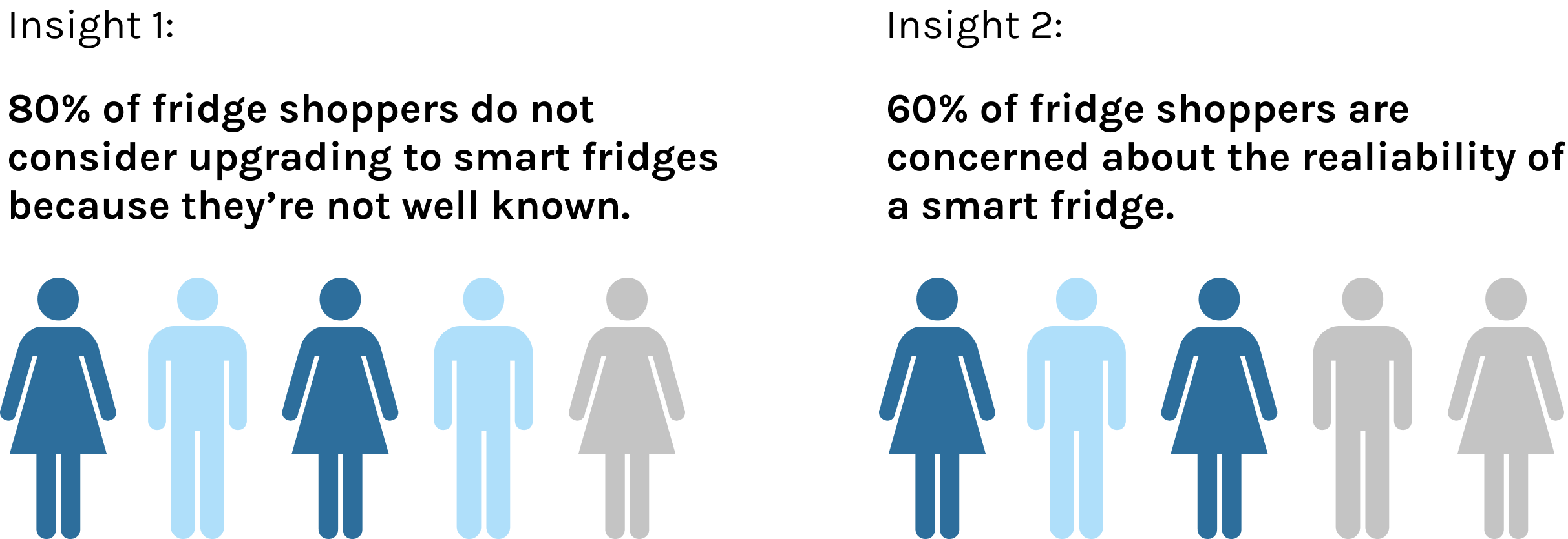
Summary of Findings:
Based on the results of this study, smart refrigerators are still not widely adopted, and the general public lacks knowledge and experience about them. Potential customers must feel CONVINCED about their decision to purchase a smart fridge and know that their investment will pay off in the end.
There is a big opportunity for the Smart Nest website to help people understand how smart refrigerators work through the landing page, product detail pages, FAQ page, instructional videos and step-by-step guides. Those who are interested in switching over to a smart fridge want to feel confident that the product will last for a long time and have customer support as problems arise.
Define
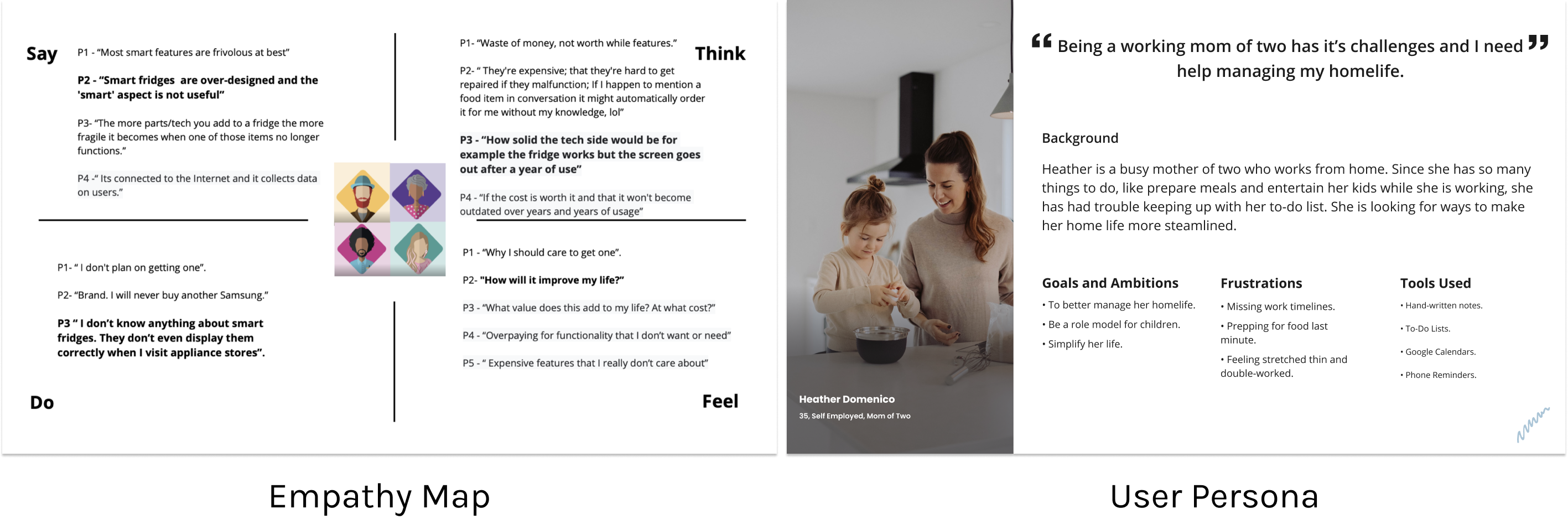
Empathy Map & User Persona:
Next, I created an empathy map and user persona based on all the data I collected during my research. Doing this exercise, gave me a better understanding of the user and an idea of who would benefit using Smart Nest.
Ideate
Card Sort:
The next step was to conduct the second phase of my UX research, I hired seven candidates for a card sorting study.
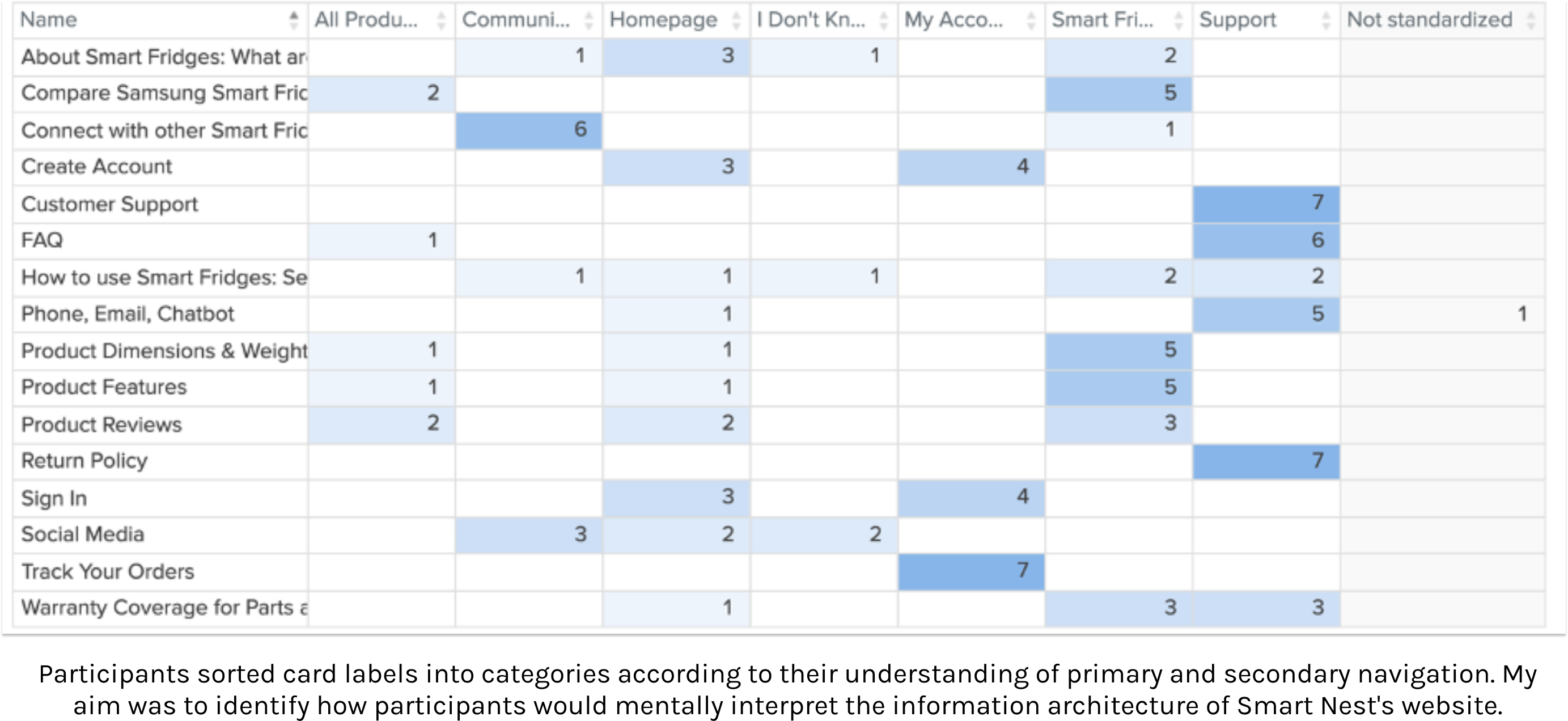
Summary of Findings:
With this information, I was able to create a website that will serve the needs of our users and facilitates the process of purchasing smart refrigerators via Smart Nest.
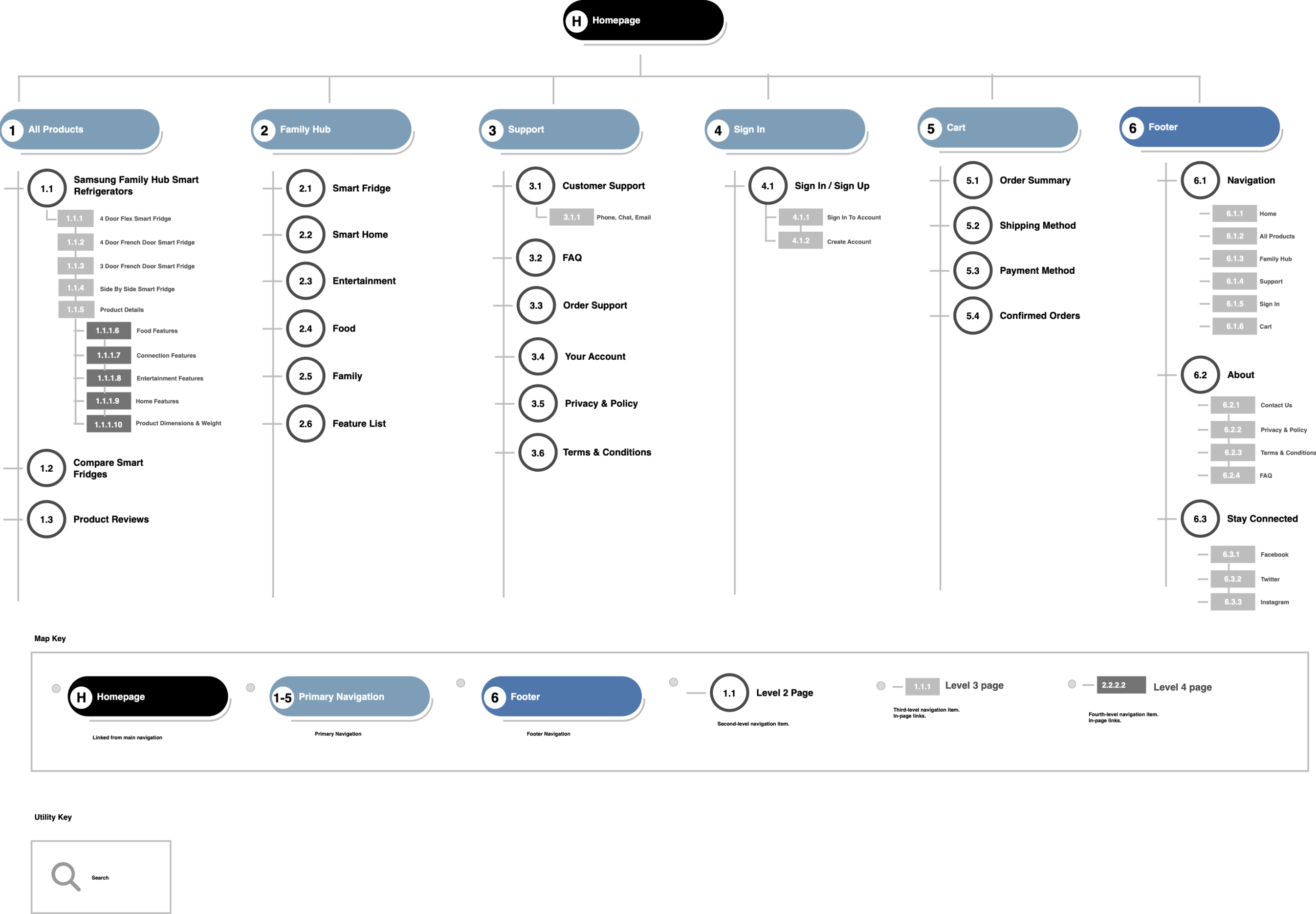
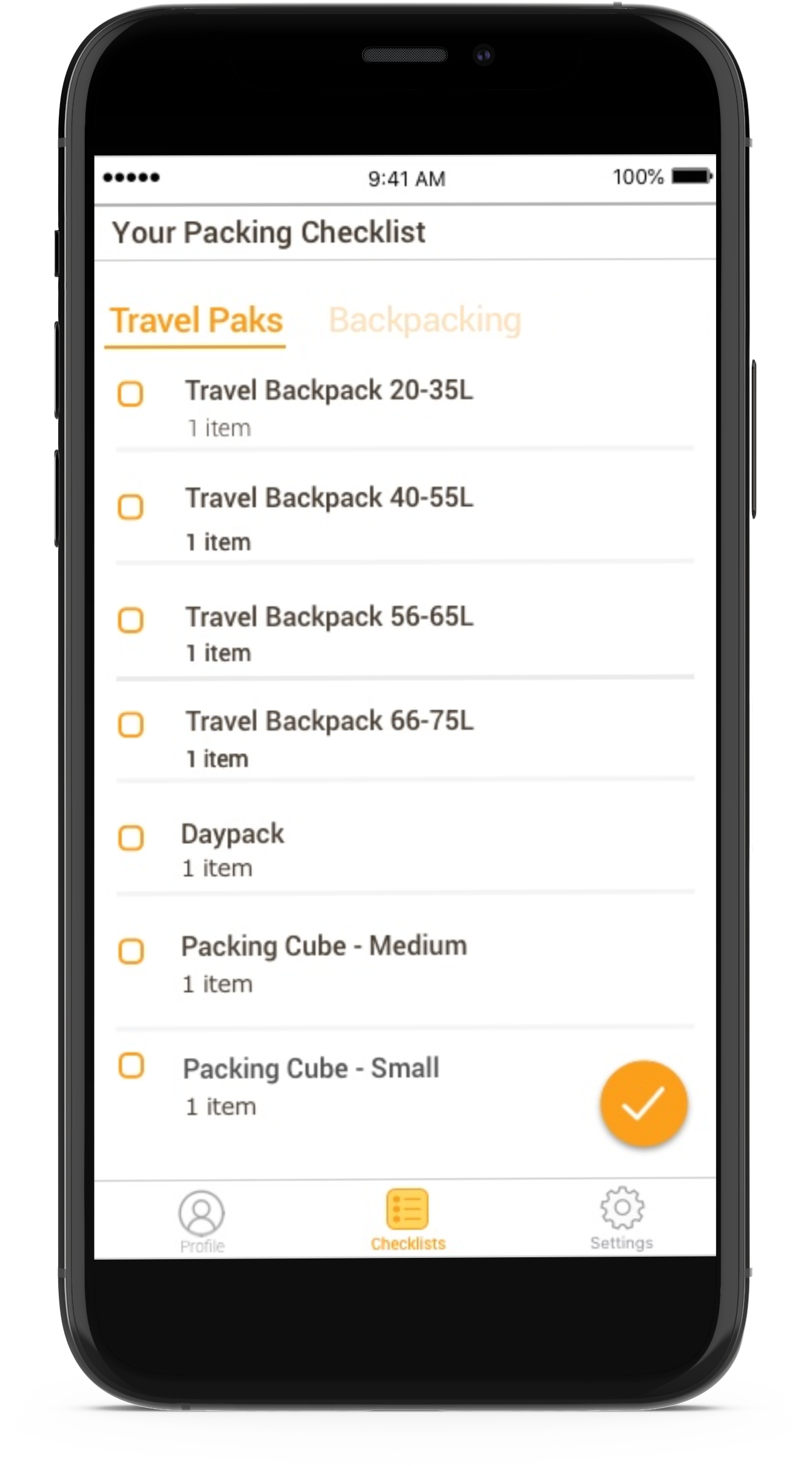
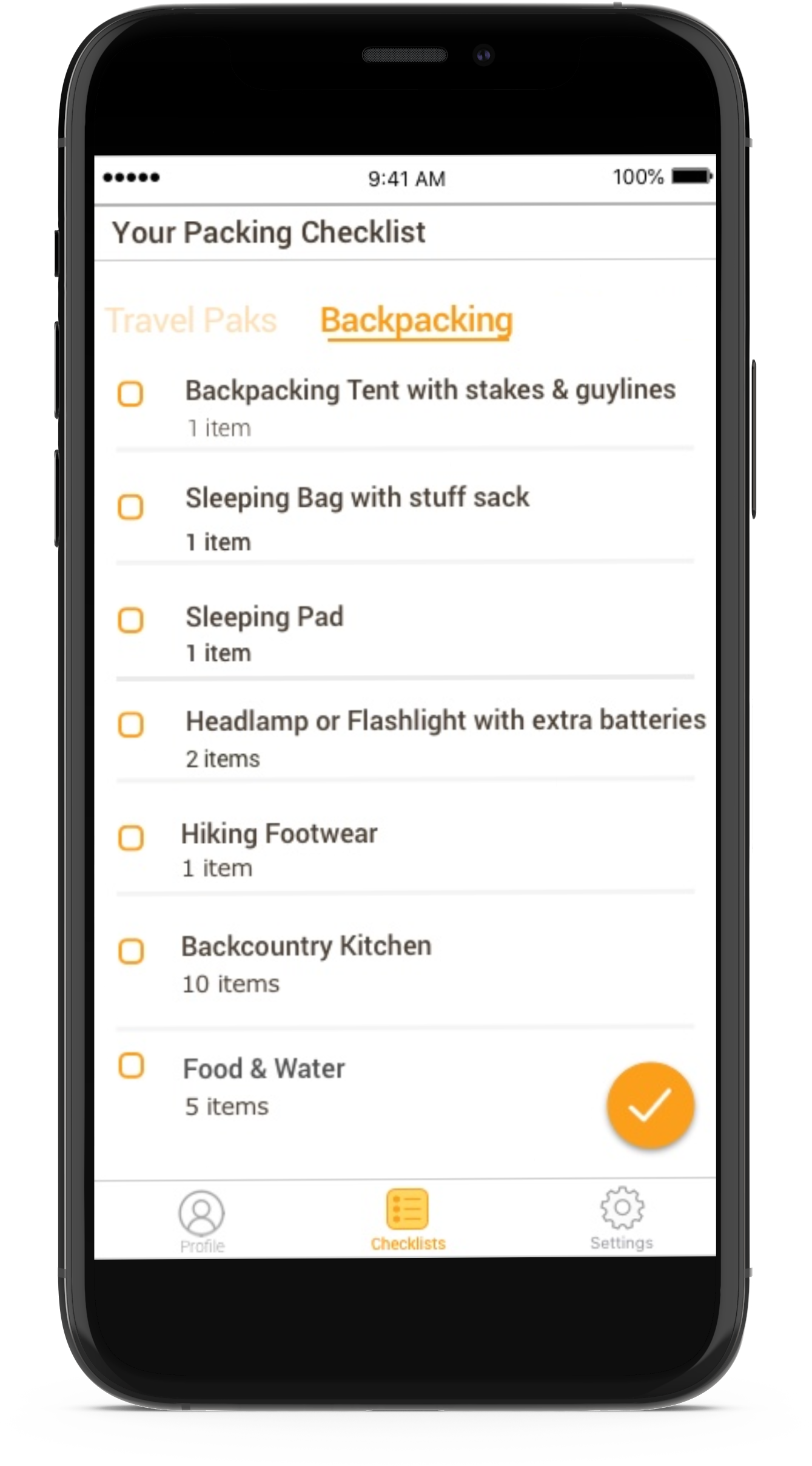
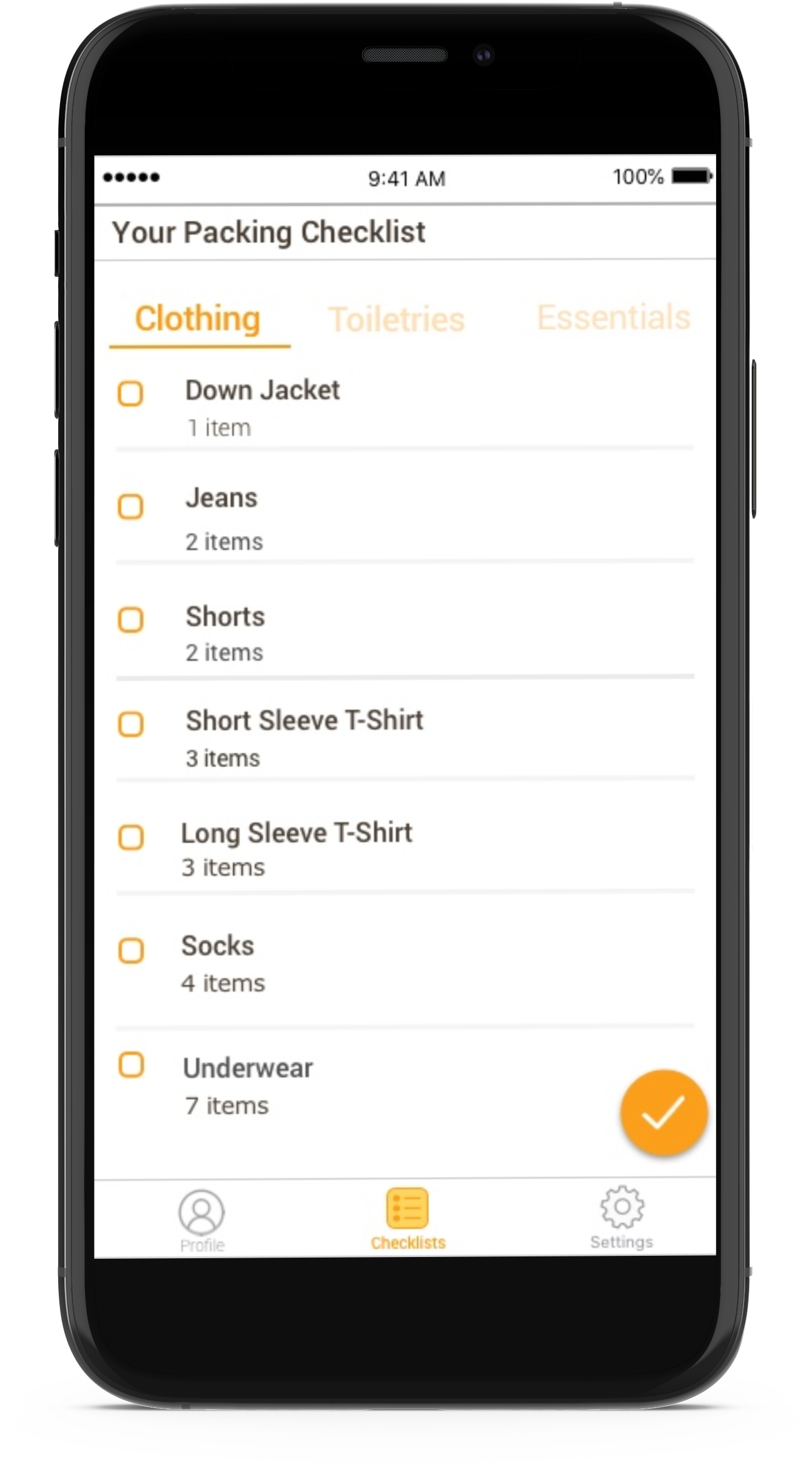
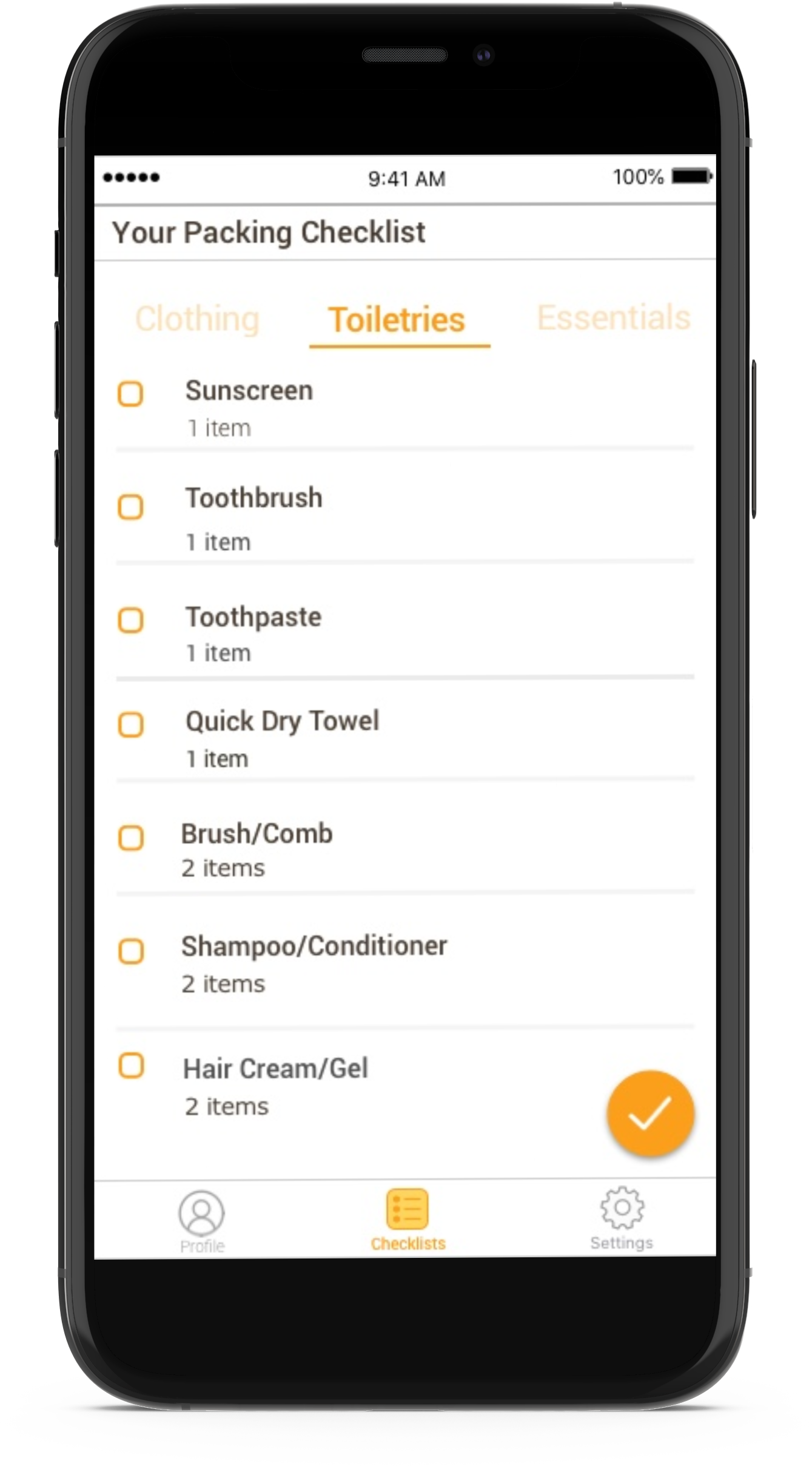
Prototype
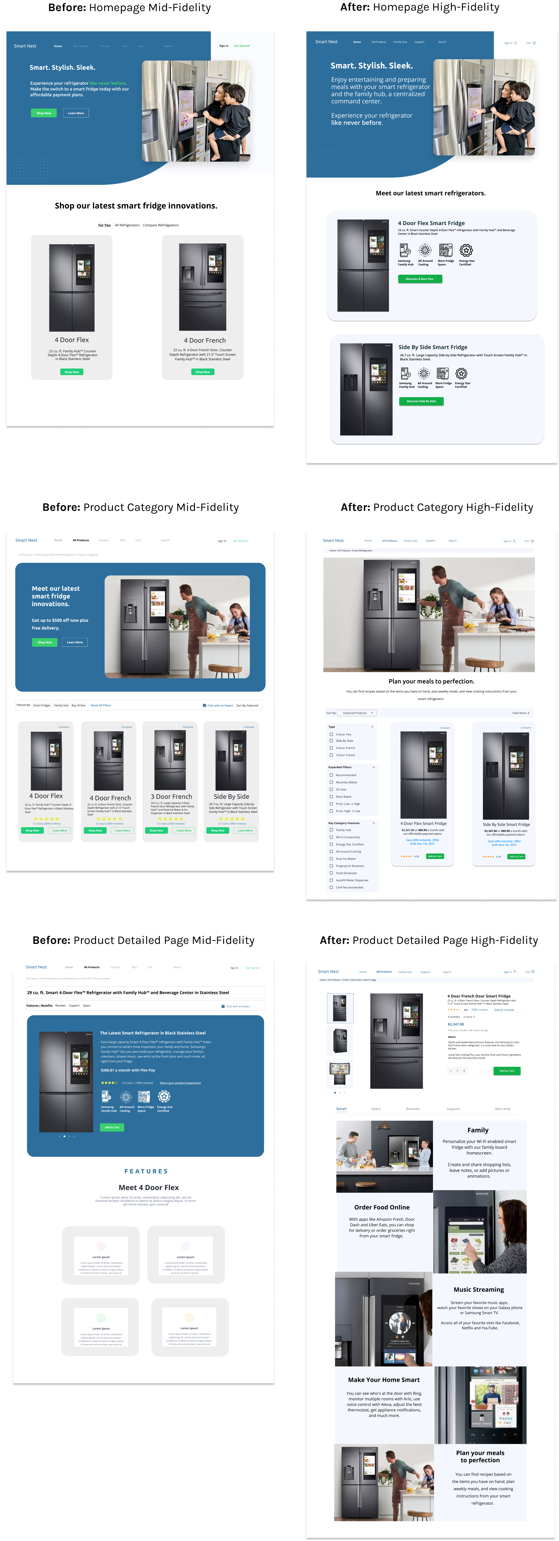
Iterative Designs:
Due to time constraints, I skipped the early iteration of wireframes and jumped right into designing Mid-Fidelity and High-Fidelity mockups. I focused my attention on the desktop experience since it's easier to navigate around a site, view images, and make purchases on a larger screen.
Below are the designs that I decided to highlight in this case study. They show the iterative process for Smart Nest. The high-fidelity version of the designs will be used to test on usertesting.com to find out what causes confusion, frustration, or delight when testing Smart Nest’s prototype.
To view annotations of ALL the high-fi designs, please click here.


Test
Usability Testing & Iterations:
While reviewing the qualitative data of my usability study, I was able to identify several missed opportunities on the prototype. Despite the fact that 5 out of 5 participants were able to complete the tasks successfully, there were elements within the task directions and prototype that caused confusion or frustration.
Areas of missed opportunities are summarized below by prototype page, finding/tasks, and severity rating. I will also include a breakdown of severity:
High - A problem that prevents the user from completing the task successfully or causes frustration and confusion.
Medium - A problem that could impede the completion of a task successfully or cause confusion and frustration.
Low - A problem that causes frustration or confusion but still allows the user to complete the task.
Homepage Results:
Participants, however, completed the task successfully, making it a low severity task.
Participants, however, completed the task successfully, making it a low severity task.
Design Recommendations:
1) Add a marketing video on the homepage so users can see how people use a smart fridge This will improve the overall user experience.
2) Reduce information overload on the homepage by condensing the content and limiting the scrolling.
3) Clearly list out smart features in concise language.
4) Re-design the homepage to make it more visually appealing and not as “flat”.
5 Step Check Out Results:
Participants, did not successfully complete the task, making it a high severity task.
Participants, did not successfully complete the task, making it a high severity task.
Homepage Results:
1) Simplify the checkout process by reducing it to just one or four easy steps. Reduce the number of clicks it takes to end purchasing goal.
2) Re-word 20% instant savings to, “ this price includes a 20% instant savings”.
Results
Final Homepage Iterations:
Smart Nest's homepage was redesigned to improve its overall usability and educational value. An introductory video on the homepage shows viewers how people interact with a smart fridge and highlights its smart features. This will give the user a quick overview of what a smart fridge is and how purchasing one can enhance their lifestyle.
As part of the redesign, four smart refrigerators were featured on the homepage with captions and icons to optimize product discovery. Users can compare smart refrigerators for the first time, review their features, and click on the CTA hyperlink to discover additional features of their chosen product. Customers can also easily read testimonies and contact us for further questions.
.png)
Final Check Out Iterations:
I combined the shipping and payment method to reduce the number of steps and make the checkout process easier for users. It's now a four-step process instead of a five-step process. Additional changes made were re-wording the 20% instant savings to read, "This price includes a 20% instant savings" and removing the progress bar considering that most users didn't pay attention to it.
.png)
Conclusion
The goal of this multi-class apprenticeship project was to polish my UX/UI skill sets and create an efficient, fast, user friendly product that would help smart fridge shoppers. By asking the right questions, being empathetic, and listening to user feedback, I was able to solve product pain points to meet the needs of my users. Given that this project was time constrained, I would have liked to receive feedback from engineers regarding the feasibility of the Smart Nest prototype and continue iterating and testing to deliver an intuitive, convincing, and stress-free shopping experience.
To view the updated version of Smart Nest prototype, please click here.