Travel Paks

Mobile Prototype for Backpacker Travel

Travel Paks is a mobile prototype designed for Backpacker Travel. It organizes backpacker items and gear into a checklist to make it easier for backpackers to plan and pack for their next trip.

Company/Project type:

Springboard Capstone Project / Mobile App

Timeline:

5 months

My Role

I worked as the Lead UX Researcher & Designer. My responsibilities included user research, concept ideation, designing user flows, visual design, prototyping, user testing, and incorporating feedback from users into iterations.

About this Project

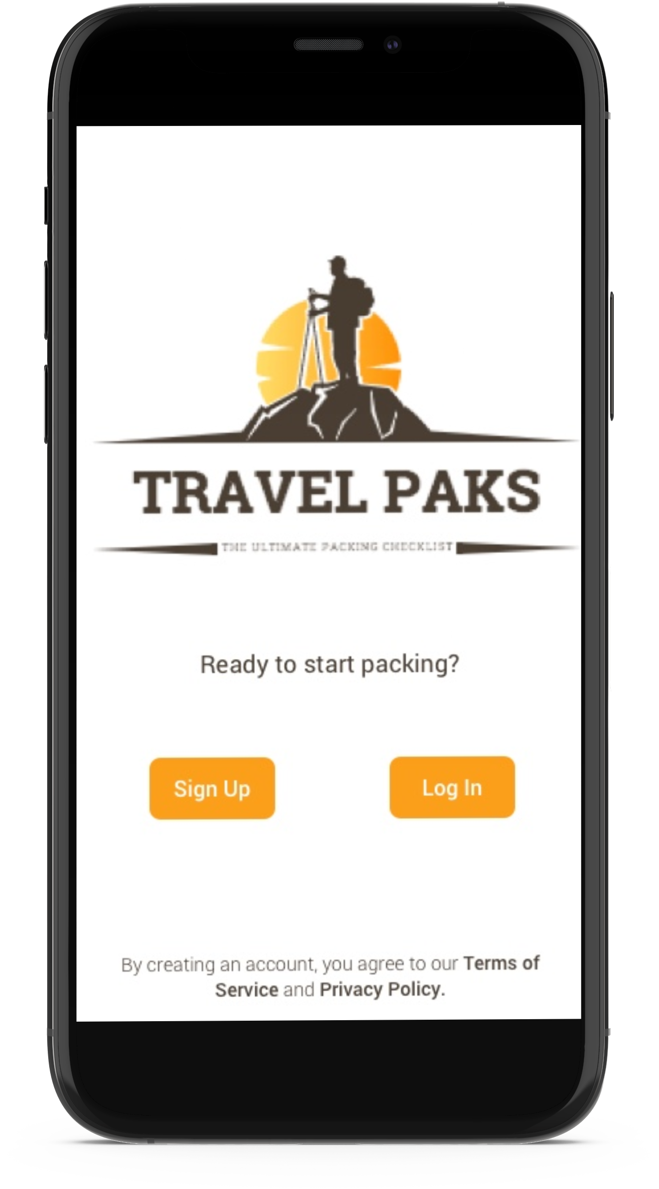
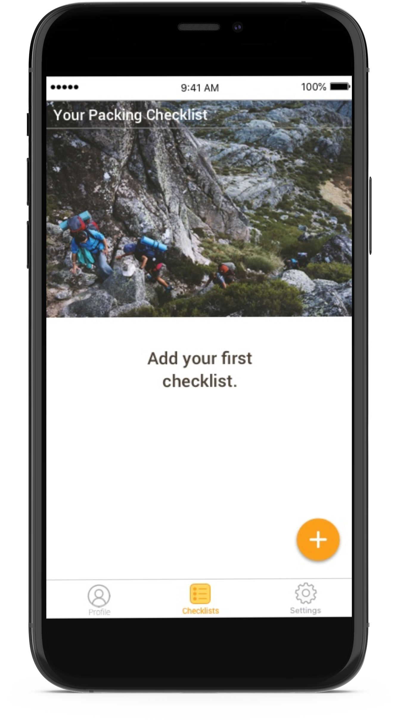
Packing before a trip can be one of the most challenging tasks a backpacker faces. No matter the length of the trip, be it a weekend trip or a three-month trek, backpackers must pack appropriately to avoid unwanted incidents during their trip. In order to ensure the next backpacking trip will go smoothly, I built a service that provides a reliable, time-efficient checklist tool for backpackers.

The challenge

Although there are different “hacks” that make packing for travel fast and easy, the experience has not advanced much in recent times. Several backpackers still face inconveniences in determining what to pack, how long to pack for, and if they’re possibly overpacking. The majority of backpackers get frustrated by this process and lose valuable time due to a lack of organization.

Solution

Using a user-centered design approach, I gained a deeper understanding of the problem space. Through surveys, I was able to empathize with my users. I surveyed 31 people to learn more about their packing habits and pain points. I then conducted user interviews to synthesize motivations and expectations into affinity and empathy maps. Next, I generated user personas to help me understand Travel Pak’s user base. Finally, I synthesized data from competitive analysis and user research to uncover key insights to generate sketches, wireframes, and a final prototype of Travel Paks App.

Discover

Competitive Analysis:

I started with a deep dive into the competition by identifying three top backpacking checklist apps that market their product as a solution to help backpackers.

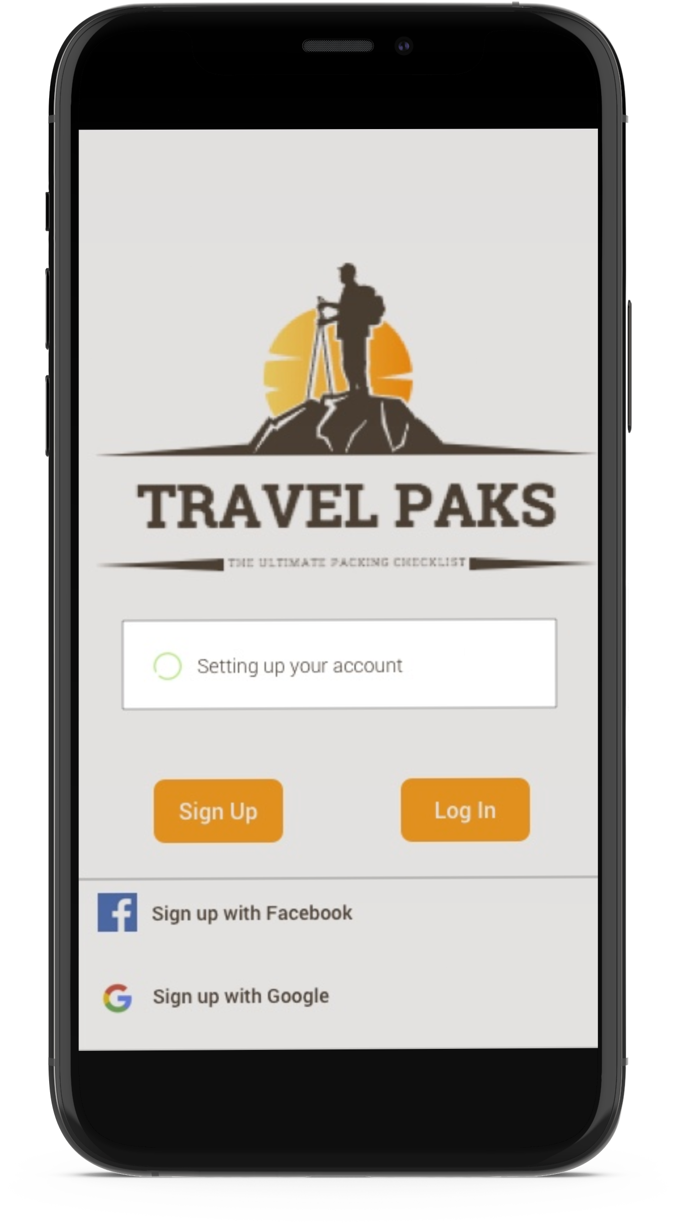
While these services provide a solid checklist platform that is fairly easy to use, I noticed that some of the apps weren’t customizable enough, sometimes it was a struggle to add, edit items or images. Also, one of the apps required to sign up for an account instead of having a single sign-on service (SSO) or one login service. With this in mind, I was able to understand the problem space better, but before I could jump into finding a solution I had to understand the user better.

Understanding User Needs:

The target market of this app are young backpackers between the ages of 18-29 who travel nationally or internationally, have stayed in backpacker hostels, enjoy making new friends, and are high-tech. Some are nomads, some are
self-employed, some teach English abroad, or are students.

To gain a deeper understanding of their needs, pain points, frustrations, and behavior, I sent out a screener survey to gain a foundational understanding of my target audience.

Here are some of the survey questions I asked:

  • What kind of backpacker are you?
  • Describe your packing style?
  • What frustrates you when packing?
  • How many hours does it take you to pack?

As I looked over the survey data, 4 major packing patterns emerged:

16.1% Pack
6-12 months at a time
16.1% Pack
gradually
26.6% Pack
day of
45.2% Pack
last minute

Having reviewed the data from my survey and seen that the majority of backpackers pack last minute, it became clear that I needed to obtain a deeper understanding of the traveler's perspective on packing and travel, which led me to the interviewing process.

User Interviews:

A total of five users participated in the interview. These interviews were done remotely and were conducted via Skype. I asked them a series of questions about packing, traveling, and backpacking.

Below are some of the questions I asked them:​

  • Can you tell me the step by step process of how you narrow down your packing items?
  • What is the ideal process for packing your backpack? How would you make it better?
  • What did you consider when purchasing your travel backpack?
  • Can you tell me what are some of the challenges when packing your travel backpack?

What I Discovered:

During the interview process, I learned that people enjoy backpacking for the experience, freedom, and connections they make throughout their travels. I also learned that they lack organization when deciding what to pack and desire to have a tool that will expedite the packing process.

Define

Affinity Maps:

The next step of my research was to gather all of the data and make sense of it by creating an affinity map. I looked through all of my notes and re-listened to the audio recordings of my interviewees. I wrote out on sticky notes, user insights, user quotes, user needs, user demographics and more. I then organized the data according to key themes: frustrations, packing process, what kind of backpack they pack in.

​To further put myself in the user’s shoes, I created an empathy map that defined one user persona. I considered what they say, do, how they would feel, what they would hear, and their pains and gains. This was such a helpful exercise since it made me understand the user better. It also gave me an idea of what kind of product to design.

I combined my findings to create one user persona that would benefit using Travel Paks App.

Michael is a travel blogger who shares his experiences on social media. Due to his busy schedule, he often packs last minute and  doesn't have time to research packing ideas, so he wants a tool to make packing easier.

Asking the Right Questions:

The last step of the research phase was to create “How Might We…” statements which provided me with the basis to start defining solutions. During this exercise I took the challenges noted during the research phase and turned them into opportunities to design.

How Might We…

  • Help relieve the frustration and stress of spending too much time packing and deciding what to wear?
  • Facilitate an environment of organization and efficiency?
  • Decrease the stress and anxiety packing last minute?
  • Improve the all around experience backpackers have while traveling with the use of this product?

All the above research combined helped me create the foundational designs for my backpacker app.

Ideate

User Story & MVP:

The next step in the UX process was to define the User Stories. I brainstormed every functional task the user may have and paired it with an outcome. I categorized these outcomes into high, medium, and low priority as well as establishing the MVP and what the next release will be for the app. Some of the main tasks the users needed to complete is setting up their account info, profile and following the step by step process of their backpacking checklist.

MVP:

Sitemap:

After working on the user stories and mvp, I decided to move on to the sitemap. I wanted to verify that the content of the app was nicely structured and that I was heading towards the right direction. The aim of the sitemap was to make sure that all the key features were housed together and that it would be easy to use.

User Flow:

To further relate and understand the user, I designed a user flow process. This process involved thinking about every step of their experience using Travel Paks App from onboarding to finish. This flow will be the blueprint to create sketches and prototypes.

Prototype

Sketches & Guerrilla Usability Testing:

Sketching really helped me visualize and discover features, elements, and icons, without worrying too much about the details of my sketch. Once I completed the sketches, I conducted a guerilla usability test with some users and quickly found out areas that I needed to improve. Users were confused to follow the 6 step process of the backpacking checklist. Users found it unclear as to what step was next and suggested that it would be helpful to have a loading bar. Users also mentioned removing Step 3 (Camping) since it's similar to Step 2 (Backpacking).

Wireframes:

After receiving great feedback from my users, I adjusted the sketches and proceeded to create the wireframe design. Every screen from user flows to design layouts was created by me. It really helped me see the bigger picture by showing me the main chunks of content, the outline and layout of structure, and UI elements.

Branding:

Once my wireframes were complete, it was time to create a styleguide for Travel Paks.

My product would include:

  • Captivating imagery that was rich in color and depth.
  • A neo-grotesque sans-serif developed by Google: Roboto
  • 3 primary colors that embrace creativity, excitement and dependability.
  • A logo that is designed to look adventurous and rugged.

Test

High Fidelity Mockup:

The next step would be to create high fidelity mockups. During this stage, I was able to fill in the details of the low-fi wireframe and get as close as possible to the final stage of the product.

Prototyping, Usability Testing & Iterations:

Using Invision, I created prototypes from the high fidelity mockups for users to test out. With these prototypes built and linked to Invision, I conducted 2 usability tests.

Round One:

In my first round of testing, I learned that users had trouble reading, "Your Packing Checklist"  and " My Checklist" due to the image background. I decided to include padding between the image and text so users have an easier time reading the texts.

Before

After

Before

After

Round Two:

In my second round of testing, I discovered that users were able to navigate the prototype easily and understood the process of creating their checklist. However, they did mention making minor changes on the placement of icons, loading bar and alignment of text.

Before

After

Final Prototype:

With the feedback that was provided, I made final tweaks to the prototypes to finalize the final product of Travel Paks App

Conclusion:

The goal of this capstone project was to create an efficient, fast, user friendly product that would help backpackers. By asking the right questions, being empathetic, and listening to user feedback, I was able to create a product that solved pain points and can make the packing experience simpler. As far as the future of Travel Paks App, I hope this tool can help as many people as possible to deliver a highly intuitive, stress-free experience.

Thank you for your time!